
Mobile-First Web Design: Creating Better Experiences for Modern Customers
 By Origin Websolutions
- Website Management
- Apr 20, 2026
- 9 minutes read
- 1,582 Views
Discover how mobile-first web design can help businesses create faster, responsive, user-friendly websites that improve customer experiences, strengthen engagement, and support online growth.
“ Mobile-first design is not about making a smaller website; it is about creating a smarter digital experience ”
Today, a large part of the customer journey begins on a smartphone. People use mobile devices to search for businesses, compare services, read reviews, explore products, contact companies, and make purchases. For businesses that want to stand out online, having a website that works well on mobile is no longer optional. It is an essential part of a modern digital strategy.

Create Better Mobile Experiences & Grow Online
Build a mobile-first website that delivers fast, responsive, and user-friendly experiences designed to engage modern customers, strengthen your online presence, and support sustainable business growth.
- Mobile-First Design
- Better User Experience
- Business Growth
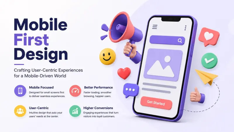
Mobile-first web design puts the mobile experience at the center of the website development process. Instead of designing primarily for desktop and adapting the result later, designers and developers begin with smaller screens and then expand the experience for larger devices. For a digital web agency, this approach creates an opportunity to build websites that are fast, accessible, easy to navigate, and focused on real customer needs.
What Is Mobile-First Web Design?
Mobile-first web design is a development approach where the website experience is planned around mobile users before adding features and layouts for tablets and desktops.
A mobile-first website considers limited screen space from the beginning. Designers must prioritize the most important content, simplify navigation, make buttons easy to tap, and ensure that pages remain useful without unnecessary elements.
The result is not simply a smaller version of a desktop website. It is a carefully planned digital experience designed to work naturally on mobile devices.
Why Mobile-First Design Matters
Customers expect websites to work smoothly regardless of the device they use. If a website is difficult to navigate on a smartphone, visitors may leave before contacting the business or completing a purchase.
Mobile-first design helps businesses create a more consistent experience by considering mobile usability during the earliest stages of development.
It can also encourage teams to focus on what really matters. With limited screen space, unnecessary content and complicated features become easier to identify and remove.
Start With the Most Important Content
A mobile screen cannot display everything at once. This encourages businesses to prioritize their most important information.
For a digital web agency, this might include:
- Business name and value proposition
- Primary services
- Key benefits
- Contact information
- Calls to action
- Customer reviews
- Important product information
Instead of overwhelming visitors with large blocks of information, the website can guide them through a logical journey.
This approach improves clarity and can make the overall website easier to use across all devices.
Create Simple Mobile Navigation
Navigation is one of the most important parts of a mobile website. Visitors should be able to find important pages without struggling with complicated menus.
A well-designed mobile menu should be easy to open, understand, and close. Important pages such as services, products, about information, and contact details should be easy to access.
Digital agencies should also avoid creating too many layers of navigation. A simpler structure generally makes it easier for visitors to find what they need.
Make Buttons Easy to Tap
Mobile users interact with websites using their fingers rather than a mouse. Buttons and links therefore need enough space to be comfortable to tap.
Calls to action such as “Get a Quote,” “Contact Us,” “Book a Consultation,” or “Start Your Project” should be clearly visible and easy to interact with.
Small buttons placed too close together can lead to accidental clicks and frustration.
Good mobile design considers how people physically interact with the screen.
Improve Website Loading Speed
Mobile users may browse websites using different network conditions and devices. A website that takes too long to load can create a poor experience.
Digital web agencies can improve performance by optimizing images, reducing unnecessary JavaScript, using efficient CSS, implementing caching, selecting reliable hosting, and minimizing unnecessary third-party resources.
Performance should be considered throughout the design and development process rather than left until the final stage.
Use Responsive Design
Mobile-first design and responsive design work closely together.
Responsive websites automatically adapt layouts to different screen sizes. Content, images, columns, navigation, and other elements can adjust depending on the available space.
A responsive approach helps create a consistent experience across smartphones, tablets, laptops, and desktop monitors.
Instead of creating completely separate websites for different devices, businesses can use flexible layouts that adapt to changing screen sizes.
Make Forms Mobile Friendly
Forms are an important conversion tool for many businesses. However, filling out a complicated form on a smartphone can be frustrating.
Mobile-friendly forms should use clear labels, appropriate input fields, simple layouts, and as few required fields as reasonably possible.
For example, a web agency requesting a project inquiry might initially ask for a name, email address, and brief description rather than requiring visitors to complete a long questionnaire.
Reducing friction can make it easier for interested visitors to contact a business.
Design for Better User Experience
Mobile-first design is ultimately about the customer experience.
Visitors should be able to understand the purpose of a page quickly, find relevant information, navigate naturally, and complete important actions without unnecessary effort.
Readable typography, appropriate spacing, clear headings, optimized images, and logical content structures can all contribute to a better experience.
A website does not need to be complicated to feel modern. In many cases, simplicity creates a stronger experience.
Support SEO With Mobile-Friendly Design
Web design and SEO should work together. A mobile-friendly website can support a broader search strategy by providing users with a better experience.
Businesses should pay attention to page structure, internal linking, content quality, mobile usability, performance, and technical accessibility.
For a digital web agency, combining mobile-first development with technical SEO can help create a stronger foundation for organic search visibility.
SEO should not be added after the website is finished. It should be considered during planning, design, development, and content creation.
Build Trust on Small Screens
Trust is particularly important when visitors are making decisions from a mobile device.
Professional design, clear company information, customer testimonials, secure connections, transparent contact details, and consistent branding can help establish credibility.
A visitor should not have to search through multiple pages to determine whether a business is legitimate or how to contact it.
A strong mobile experience makes important trust signals easy to find.
Test Across Different Devices
A website that looks excellent on one smartphone may not behave exactly the same way on another device.
Digital agencies should test websites across different screen sizes, browsers, operating systems, and connection conditions.
Testing should cover:
- Navigation
- Forms
- Buttons
- Images
- Page speed
- Text readability
- Menus
- Checkout processes
- Contact functionality
Real-world testing can uncover issues that are difficult to identify from a single desktop screen.
Use Analytics to Improve the Experience
Launching a mobile-friendly website is not the end of the process. Analytics can reveal how visitors actually use the website.
Businesses can monitor mobile traffic, engagement, conversion rates, popular pages, and potential drop-off points.
If mobile visitors frequently leave a particular page before completing a form, for example, the business can investigate whether the page needs a simpler layout, clearer information, or a shorter form.
Continuous improvement allows a website to evolve alongside customer expectations.
Stand Out From the Crowd
Many businesses have websites, but not every website provides a smooth mobile experience.
A business can stand out by creating a mobile-first website that combines attractive design with speed, clarity, accessibility, useful content, strong branding, and conversion-focused functionality.
The goal is not to add more features. It is to create an experience that helps customers accomplish what they came to the website to do.
Conclusion
Mobile-first web design is an important foundation for modern digital experiences. By designing around mobile users from the beginning, businesses can create websites that are easier to navigate, faster, more accessible, and more focused on customer needs.
For digital web agencies, mobile-first development provides an opportunity to combine design, development, SEO, performance, and conversion strategy into one cohesive approach.
A successful website should not simply look good on a smartphone. It should make every interaction feel simple and purposeful. When businesses prioritize mobile customers, they can create stronger digital experiences, build trust, increase engagement, and create more opportunities for sustainable online growth.
1. What is mobile-first web design?
Mobile-first web design is an approach where the website is initially designed and developed for mobile devices before being expanded and optimized for larger screens.
2. Why is mobile-first design important for businesses?
It helps businesses provide a better experience for smartphone users, improve usability, simplify navigation, and create a website that works effectively across different devices.
3. Is mobile-first design the same as responsive design?
They are related but different. Mobile-first is a design and development approach, while responsive design allows a website's layout to adapt to different screen sizes.
4. Can mobile-first design improve conversions?
Yes. Clear navigation, easy-to-use buttons, simple forms, fast loading, and focused content can reduce friction and make it easier for visitors to complete desired actions.
5. How does mobile-first design affect SEO?
A mobile-friendly experience can support SEO by improving usability, accessibility, performance, and the overall experience for users who access websites on mobile devices.
6. How can I make my website mobile friendly?
Use responsive layouts, readable typography, touch-friendly buttons, optimized images, simple navigation, mobile-friendly forms, and fast-loading pages.
7. Why is website speed important on mobile?
Mobile visitors may have slower connections or less powerful devices. Faster pages can create a smoother browsing experience and reduce frustration.
8. Should mobile websites have shorter content?
Not necessarily. The content should remain useful and complete, but it should be structured with clear headings, short sections, readable paragraphs, and an easy-to-scan layout.
9. How should mobile forms be designed?
Mobile forms should be simple, clearly labeled, easy to tap, and limited to information that is genuinely necessary for the initial conversion.
10. Can a digital web agency create a mobile-first website?
Yes. A digital web agency can combine UX design, responsive development, performance optimization, SEO, content strategy, and conversion-focused techniques to create a modern mobile-first website.
Origin Websolutions
Origin Websolutions is a team of web development and digital marketing professionals sharing practical insights on SEO, digital marketing, website development, content strategy, and online business growth. The team simplifies complex digital topics and provides useful tips, trends, and strategies to help businesses strengthen their online presence and grow.